Shopping centre and car park "Terminal M" in Eindhoven did not comply with proper routing. Customers were driving the wrong way, against the direction, even resulting in collisions.
We were brought in to create a logical, and above all, clear routing in this.
"Obviously, but it can have a bit of atmosphere," it was said.
Well, das worked out well we thought ourselves. (and so did the customer)
We have
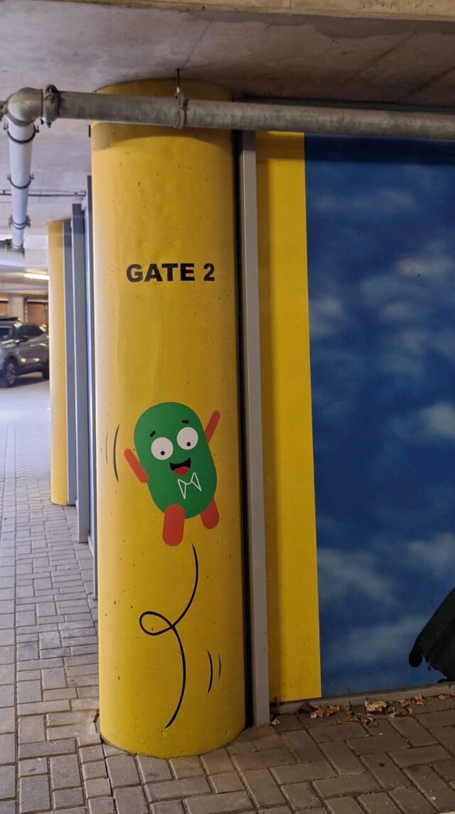
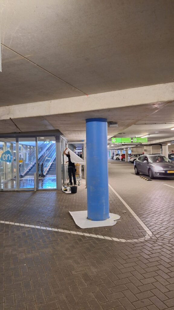
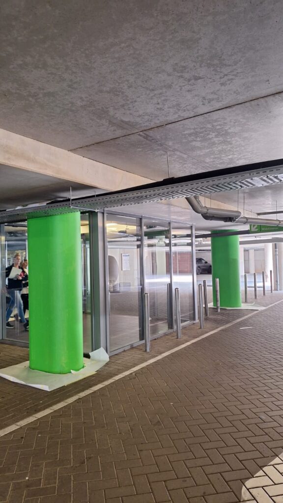
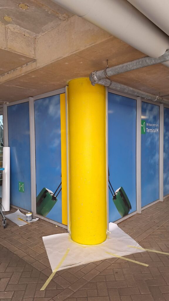
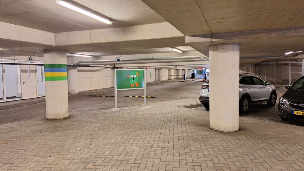
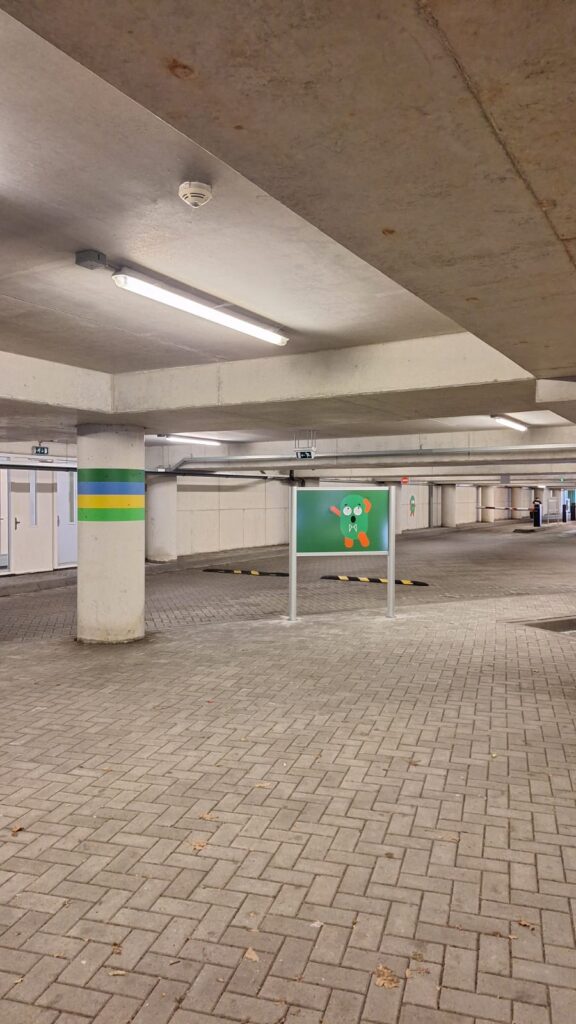
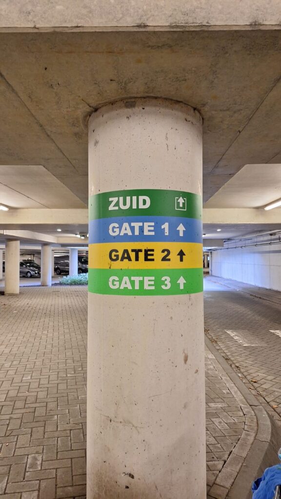
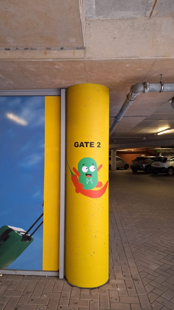
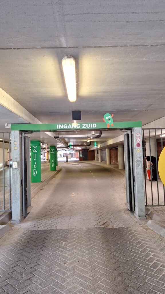
- various concrete posts coloured
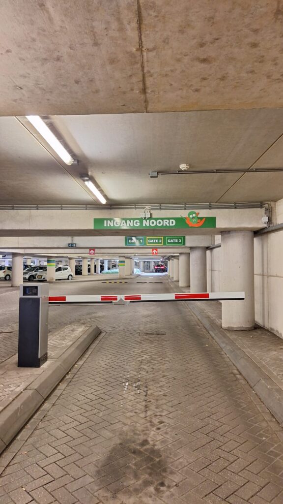
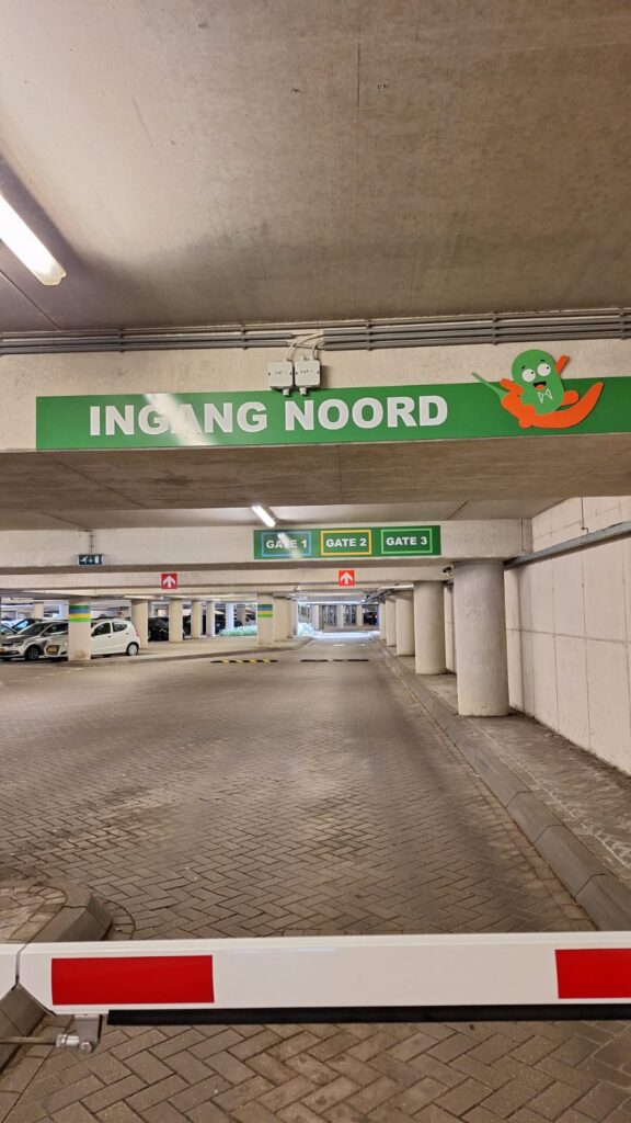
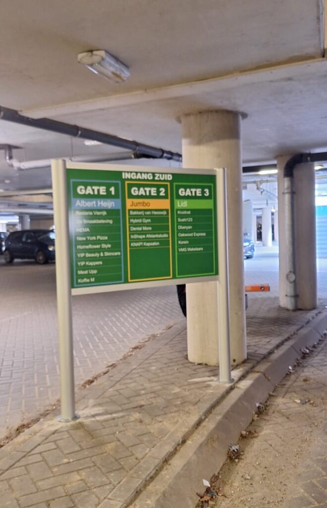
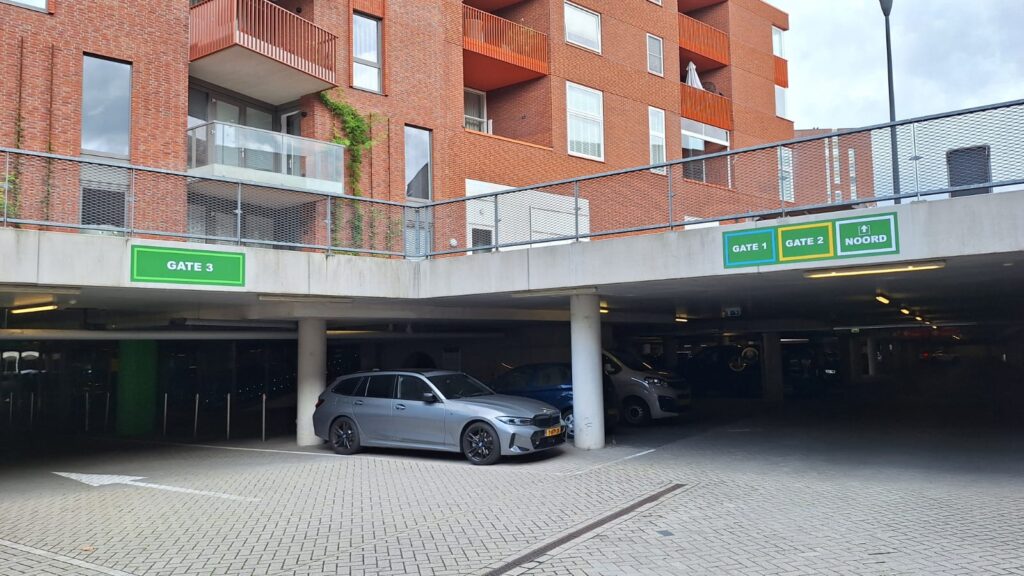
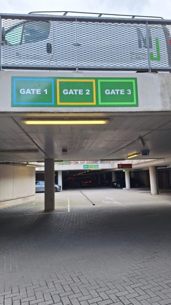
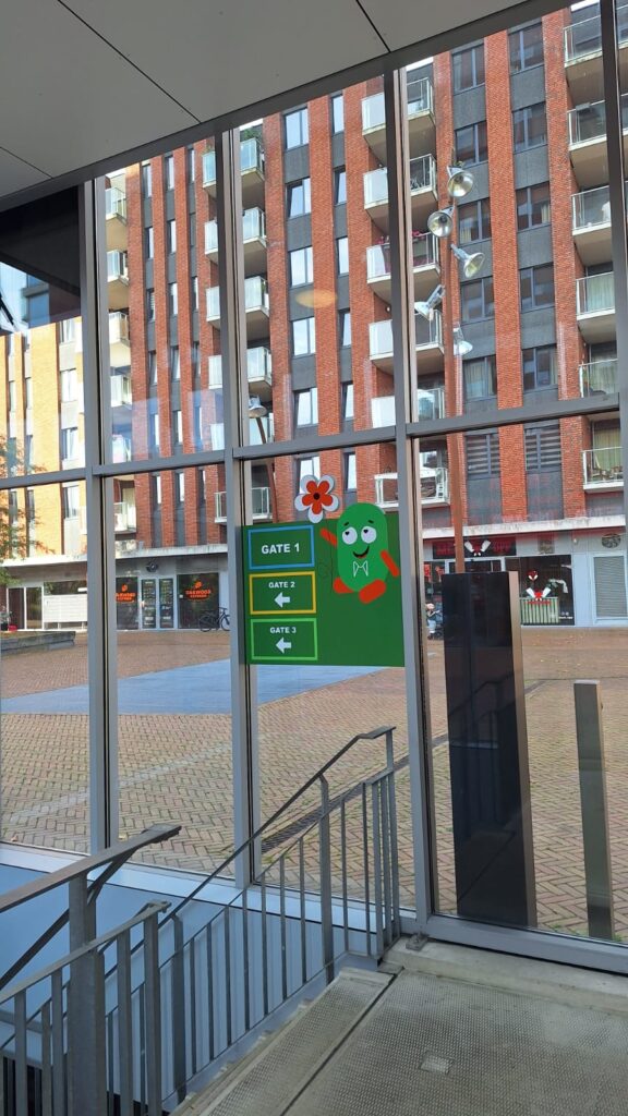
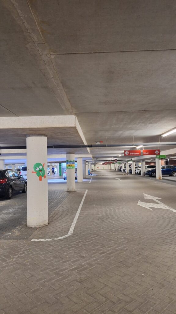
- routing signs placed. Both in the ground and against the walls
- applied the correct directions on the concrete pillars
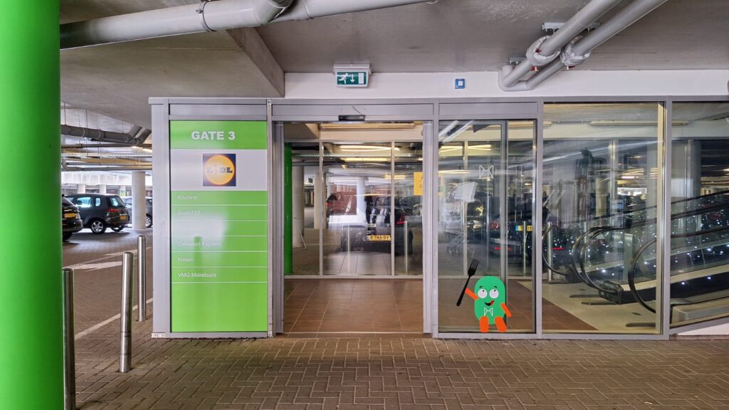
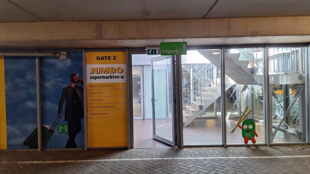
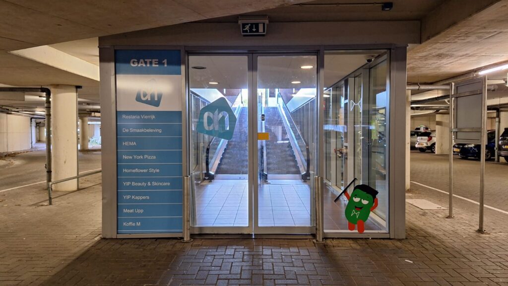
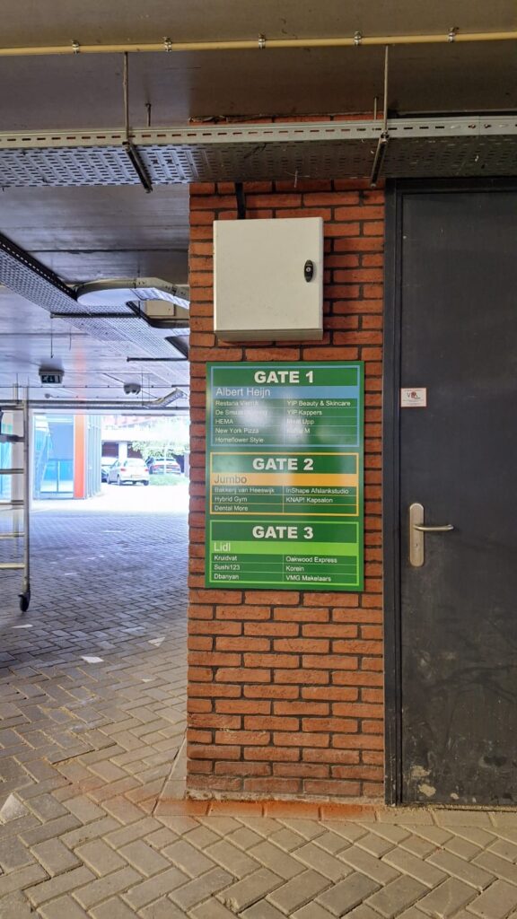
- the correct listing of shops indicated at the various entrances to the shopping deck
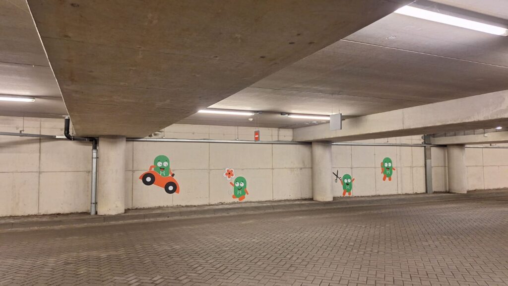
- making the "Terminal M" mascot recur repeatedly in the overall image.
Everything runs and drives a lot smoother now because people are now directed by the clear routing.

